
How the Mt. Gox rehab plan and Omicron emergence act as a sword of Damocles above otherwise splendid on-chain supply dynamics.
December 1, 2021
Cycling On-Chain is a monthly column that uses on-chain and price-related data to better understand recent bitcoin market movements and estimate where we are in the cycle. This seventh edition first addresses several on-chain and derivatives-related metrics to gauge the current bitcoin market structure. Then, it discusses two developing narratives that are introducing some fear into the market: the Mt. Gox rehab plan and the emergence of the omicron COVID-19 variant. Finally, we’ll conclude with the results of our monthly poll and the halving cycle roadmap.
Return Of The Hashes
In June 2021, the Chinese government cracked down hard against Bitcoin, banning its mining and censoring exchanges (see COC#2). During that period, Bitcoin’s hash rate halved, creating major fear in bitcoin markets. Since the start of July, the return of that hash rate has been an absolutely stunning phenomenon, illustrated by a streak of nine consecutive positive difficulty adjustments that was just ended by a minor correction (figure 1).
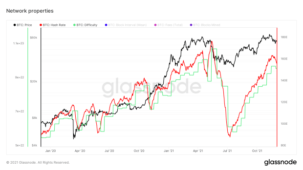
The return of this hash rate to the levels of prior highs is by itself a good thing, but even more so when taken into account that the age-old “China controls Bitcoin” narrative is now no longer valid. A recent report by the Cambridge Centre for Alternative Finance confirmed that China now supposedly has a (near) zero share in global bitcoin mining.
Exchange Balances Keep Dropping
During the mid-May capitulation event that triggered a cascade of long liquidations that exacerbated the drop (see COC#1), there was a period where lots of bitcoin were deposited on exchanges. However, exchange balances resumed their downward path quickly after. Current exchange balances are at multi-year lows — we need to scroll back more than three years to identify the last time exchange balances were at these levels (figure 2).
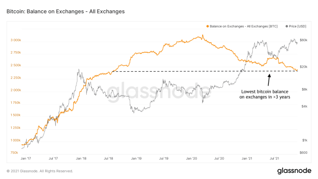
An explanation for this can be sought in improvements of both noncustodial (e.g., hardware or software wallets) and custodial (e.g., professional services that store coins for institutional investors) storage solutions. Either way, the mass exodus of coins off exchanges can be interpreted as a sign that whoever is holding those coins likely does not have the intention to sell them short term. More importantly, the lower the bitcoin supply on exchanges, the quicker exchange balances run short during periods of high demand, causing bitcoin to trade more reflexively. This is sometimes called a supply shock.
The Bitcoin Supply Keeps Becoming More Illiquid
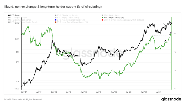
More evidence that there is a trend that more and more bitcoin is moving into the hands of entities that are unlikely to sell can be found in Glassnode’s “illiquid supply” metric. After all, that is exactly what the metric was built for.
Since most financial markets — including bitcoin — crashed hard mid-March 2020, the percentage of the circulating bitcoin supply that Glassnode classifies as “illiquid” has been going up. After a clear drop during the mid-May 2021 capitulation and cascading liquidation event that was also mentioned above, it is currently again in a rapid upward trajectory (figure 3).
Bitcoin Futures Markets Are Healthier
Another positive aspect when it comes to gauging the current status of bitcoin markets is that derivative markets appear to hold less downside risk than they did during the start of the year (see COC#6).
Compared to early 2021, we are seeing similar levels of open interest, which is the total value of all outstanding bitcoin futures positions (figure 4, blue). Unlike then, bitcoin futures markets now have much lower funding rates (figure 4, green), which means that the market does not have the relatively extreme tendency to go (leveraged) long than it did back then.
Furthermore, the percentage of open interest that is backed by bitcoin has declined from the mid-60s to mid-40s (figure 4, red). Since cash is better at holding its value during a bitcoin price dip and thus less prone to be pushed below the liquidation point where the position is auto-sold, it is a superior collateral for BTC longs. The opposite is true for shorts. If the bitcoin price soars, the collateral of BTC shorts that are cash-margined loses value on a relative basis, making shorts more vulnerable to be liquidated.
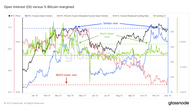
Compared to early 2021, the bitcoin futures markets are, therefore, healthier. They are less tilted toward a positive bias and have a collateral structure that has less downside risk.
A Mempool Full Of Crickets
As already pointed out in COC#4 at the start of September, it has been very quiet on the Bitcoin blockchain for a few months now when it comes to transactions. The incredibly low average transaction fees that we have seen over the last few months (figure 5) are a good example of that. If there is (almost) no waiting line in front of the attraction we’re trying to get into, there’s no need to pay unnecessary high entrance fees.
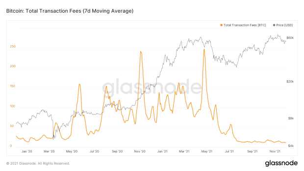
Although the cause of this is likely at least partially technical (e.g., recent Lightning and Segwit adoption, see COC#4), it is likely that another large explanation can be sought in the relative absence of retail in the current market. In COC#6, some other examples of this were described, such as the relatively low Google search trends.
LTH Profit Taking Was Enough To Satiate Recent Market Demand
Around this time in 2020, the Bitcoin blockchain was everything but a ghost town. The bitcoin price had just broken through its 2017 ~$20,000 all-time high, as the world was waking up to a buzzing hive full of cyber hornets and first-time institutional interest. As illustrated in figure 6, long-term holders were already selling parts of their positions into market strength (middle red box), but the market demand was so high that price just kept churning up.
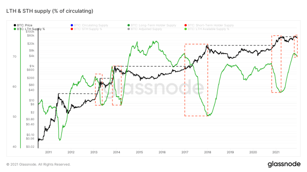
Last month’s ~$69,000 all-time high is a different story. After breaking the previous ~$65,000 all-time high, price briefly peaked but quickly retreated back to the price levels it came from as soon as long-term holders started their traditional modest profit taking (right red box). Unlike last year, we’re currently not in a bull market with a similarly broad support base, but from what it looks like coming from a more concentrated group of entities.
If that observation is correct, it is not necessarily a bad thing. It would mean that it is less likely that we’ll see a straight away exponential take-off like we did late 2017 and late 2020, but also less likely that we’ll see major price corrections to compensate for frothiness.
Current Outlook Based On On-Chain And Derivatives Data
Compared to early 2021, the bitcoin market looks structurally healthier in a plethora of ways: fundamentally, leverage-wise and based on on-chain trends. The missing ingredient that is needed to send it off to a new round of price discovery seems to be just a spark that ignites a new influx of (retail) market participants.
If there are no surprise events that create another significant market downturn, the ever-present buying pressure of the large number of entities that is dollar-cost averaging (DCA) into bitcoin might be enough to become that spark by continuously pushing price toward recent all-time highs, drawing attention via news outlets. However, there currently are two concrete threats floating around that could spoil the chances of such a continued short-term bull trend.
Mt. Gox Situation Rehab Plan
In 2014, online trading platform Mt. Gox (which comes from “Magic: The Gathering Online eXchange,” as the platform was originally built to exchange cards of the popular fantasy-based card game) was hacked. Approximately 850,000 bitcoin (valued at around $450 million at the time) were reported to be stolen, making it the biggest exchange hack (in BTC terms) in Bitcoin history.
About 200,000 of those were retrieved. Later evidence would show that “most or all of the missing bitcoins were stolen straight out of the Mt. Gox hot cryptocurrency wallet over time, beginning in late 2011.” In hindsight, what went on behind the scenes was a bizarre scenario that sounds like something that came from a movie script. More details about the Mt. Gox hack can be found here.
Since then, the ~127,000 creditors have waited for around seven years full of lawsuits to get back their share of the remaining piece of the pie. On November 17, 2021, the “Mt. Gox Bitcoin rehab plan” that would distribute the final remaining 141,686 bitcoin among creditors of the hack was finally approved. The big question mark that is now still hanging around in the air is when they will receive them back.
Although it is impossible to know what these creditors will do with this bitcoin when they receive them, it is well possible that a (low conviction) portion of them may jump on the opportunity to liquidate their long-awaited bitcoin at a ~200 times return once they receive it back. Such a situation could be compared to a significant number of bitcoin going from an illiquid to a liquid state, potentially sending the price down.
The perspective of 141,686 previously locked-up bitcoin potentially becoming liquid understandably brings some fear into the bitcoin market but might not even be the biggest threat for short-term price action.
Omicron
Last week, the new variant of COVID-19 called “omicron” was discovered in South Africa, where it appears to be spreading exponentially. Omicron is said to have about 30 mutations on the coronavirus’ spike protein, potentially making it more infectious than the delta variant that is currently dominant. Since then, the new variant has been discovered in multiple geographically distributed countries as well and is expected to spread more widely soon.
There aren’t a lot of facts available regarding the new omicron variant, its transmissibility, how harmful it is compared to previous variants, and thus to what degree it is an actual threat to public health (e.g., effectiveness of current vaccines against it). It will likely take weeks for more details on these aspects to become available. So far the early rumors seem to suggest that the new variant may be more infectious but less harmful.
Either way, global financial markets quickly started pricing in the non-zero chance of this new COVID-19 variant creating havoc. Last Friday, the S&P 500 closed 2.27% lower than it did the previous workday. Bitcoin did even worse, closing 8.76% lower. Although that is not necessarily surprising. Since bitcoin started being adopted by worldwide financial institutions and is now considered a bona fide macroeconomic asset, it regularly sells off when the broader financial markets do.
Correlation Between Bitcoin And The S&P 500
On a larger time frame, the bitcoin price has little to no correlation to other macro assets. Figure 7 visualizes the realized one-month correlation between bitcoin and the S&P 500, which averages out at 0.08% since April 17, 2018. The colored zones reflect correlation levels that are negligible (0.00–0.30, white), low (0.30–0.50, blue), moderate (0.50–0.70, yellow), high (0.70–0.90, orange) or very high (0.90–1.00, red).
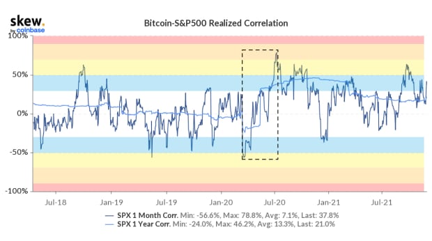
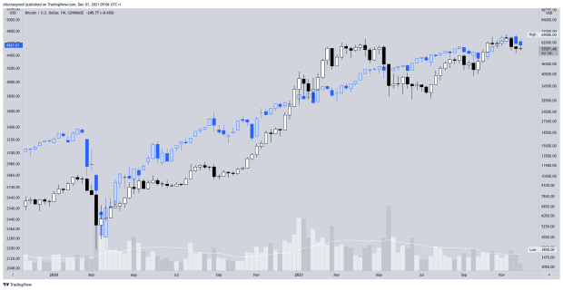
However, there are periods where the bitcoin price increasingly travels along with the S&P 500. The March 2020 sell-off in global financial markets is a good example of this. On March 12 and 13, 2020, bitcoin made a dramatic 50% sell-off alongside the S&P 500 and many other assets, after which both followed a similar V-shaped recovery. During that period, highlighted in the box in figure 7, the one-month correlation between bitcoin and the S&P 500 increased from a low negative correlation to a moderate positive correlation. The actual price action of both assets since the start of that period is visualized in figure 8.
Macroeconomic Differences To The March 2020 Crash
While there is a chance that the new omicron variant is actually less harmful than the currently dominant delta variant, the chance of it being more harmful is what impacts markets. After all, if we were to see a repeat of the March 2020 situation where the world locks down and financial markets crash hard, you’re much better off if you got out before.
A naïve solution for such a repeat scenario could be to simply just copy-paste the monetary and fiscal policies of 2020. After all, didn’t they sort of “work” last time, at least according to the standards of the respective policy makers?
Let’s have a look at what they actually did last time around. Figure 9 displays the “Federal Funds Effective Rate” and shows that, during the response to the first major COVID-19 outbreak in early 2020 (gray area), they plummeted from above 1.5% to about 0%. Doing so was a way to stimulate the economy by making it easier for institutions to lend money.
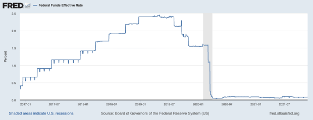
Figure 9 also shows that after bricking the effective rate, the Federal Reserve (Fed) never got around to significantly raising it again. Just talking about increasing rates already caused short-term stock market dips recently. The Fed currently has a plan to gradually increase interest rates over the next two years, but some question whether that is actually feasible without tanking the stock market, which they will not want to do.
More simply put, the Fed appears to be stuck here at near-zero rates. If increasing rates at relatively favorable market conditions is already hard, imagine what their palette of choices looks like if the economy were to take a nosedive again.
Money Printer Goes Brrr
Besides cutting interest rates to zero, the “Money printer goes brrr” meme that became an instant hit in 2020 does a good job at explaining what else central banks did in response to the economic impact of the COVID-19 related policies. It printed money. A lot of money.
Figure 10 shows that 45% of all $6.331 trillion dollars (not credit, actual monetary base dollars) that currently exist were printed since the start of COVID-19 (most right gray area).
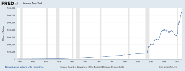
With interest rates near zero, printing actual dollars is arguably the Fed’s largest, if not only, remaining weapon to stimulate the economy during times of hardship.
Inflation Has Officially Arrived
Sustained increase of the money supply is the literal definition of monetary inflation. One of the side effects of sudden monetary inflation is that when the money drips down across the economy, it means that there are eventually more dollars circulating in the hands of the same number of entities that are traded against the same number of goods and services. A logical result may be that the prices of those goods and services would then start to increase.
Which is exactly what we’re currently seeing in the consumer price index (CPI), which represents the annual price increase of the respective basket(s) of goods. The content of those baskets of goods has repeatedly changed over time. Skeptics, therefore, consider the CPI a flawed metric that presents an underrepresentation of the actual inflation. Regardless, figure 11 shows that recent CPI prints actually are setting multi-decade highs, illustrating how extreme current inflation trends actually are.
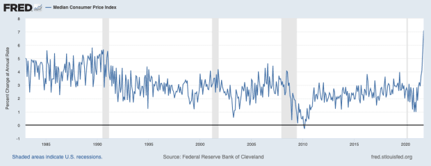
Some economists suggest that the current inflation spike is not necessarily a direct result of recent monetary policy but is more likely the result of supply shortages. According to these economists, we collectively bought considerably more goods during the lockdowns to compensate for the large decline in spending on services, which coincided with multiple supply chain problems, for example, related to travel restrictions or not being able to work. Some of these economists do believe that monetary expansion may cause these inflation levels to remain elevated over a long period, though.
Either way, the Fed is currently also between a rock and a hard place here. Printing large quantities of money possibly isn’t going to be as straightforward now as it seemed to be at the beginning of 2020. But can the Fed realistically do anything else, since not intervening will almost certainly mean the economy will go into a deep depression, potentially resulting in a fatal collapse for several over-indebted industries? Time will tell whether the Fed will need to intervene again, and if so, how they will do it and what its impact will be.
Bitcoin Market Sentiment
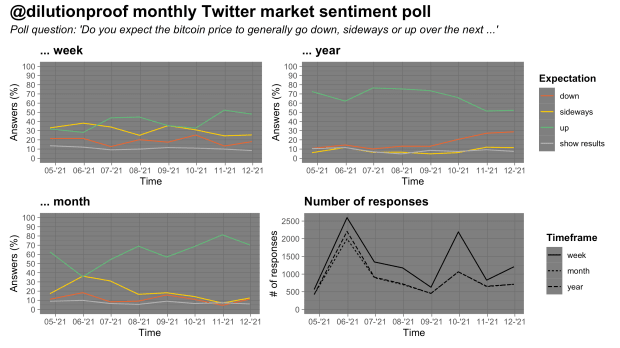
As always, I’ve taken a monthly Twitter poll to get a rough gauge for the current market sentiment. Such polls always need to be interpreted with a grain of salt due to possible selection bias, but the evolution of the results over time can be interesting.
This month’s poll (figure 12) painted a similar picture to those of the previous months: Respondents are predominantly bullish, on all time frames (weekly, monthly and yearly). However, the group of respondents that expects a potentially downward price trend a year from now appears to be growing in recent months.
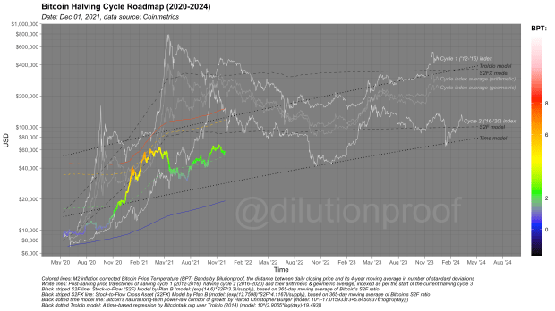
Bitcoin Halving Cycle Roadmap
So far, every Cycling On-Chain has closed off with the Bitcoin Halving Cycle Roadmap (figure 13). The roadmap visualizes the bitcoin price, color-overlayed by the Bitcoin Price Temperature (BPT). The rest of the graph includes price extrapolations based on two time-based models (dotted black lines), the Stock-to-Flow (S2F) and Stock-to-Flow Cross Asset (S2FX) model (striped black lines) and cycle indexes for cycles 1 and 2 (white lines) and the geometric and arithmetic averages of those (gray lines). These models all have their own limitations, but together give us a rough estimate of what may be ahead if history does turn out to rhyme once again.
Previous editions of Cycling On-Chain:
- #1 Unwinding Leverage (June 1, 2021)
- #2 Bitcoin Enters Geopolitics (July 1, 2021)
- #3 Squeezed Supply, Shorts And Bitcoin Lemonade (August 1, 2021)
- #4 On-Chain Silence Before The Storm (September 1, 2021)
- #5 How January’s On-Chain Footprint Bent The Bitcoin Price Trend Twice (October 1, 2021)
- #6 “Smart Money” Is Front-Running Retail (November 1, 2021)
Disclaimer: This column was written for educational and entertainment purposes only and should not be taken as investment advice.
This is a guest post by Dilution-proof. Opinions expressed are entirely their own and do not necessarily reflect those of BTC, Inc. or Bitcoin Magazine.
Leave a Reply